Getting Started with the Dundas Dashboard
Analytical Dashboard
The analytical dashboard displays the raw data of a Microsoft OLAP cube. Its Drag & Drop interface allows browsing all of the metrics and dimensions, and then plotting them onto a chart or grid for instant analysis. It lets you perform advanced filtering & sorting, apply formulas, and drill down to see advanced details. Using the analytical dashboard can also export your results to a spreadsheet. The business user can schedule reports to automate data export.
Dundas Toolbar

How to
Analytical dashboards use axes to allow viewers to choose what data is displayed. There are four different types of axes available, each of which determines user’s view of the data in different ways:
- Measures: Determines the measures displayed as columns in a grid or the data series displayed in a chart.
- Categorical: Dimensions added to this axis determine the dimension members displayed as rows in a grid or on the X axis of a chart.
- Grouping: Adding a dimension to this axis is optional, and will split up the measure values into separate columns for each grouping dimension member. On a chart, each series is split by the grouping dimension members.
- Slicer: Filters the data to return measure values pertaining only to the dimension members selected.
Do one of the following.
- Click Totals to show or hide total values in the OLAP grid for all columns and rows.
- Click the Totals down arrow to open a selection menu to show or hide Categorical or Grouping (series) axes
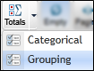
Total values are displayed in extra rows or columns with bold text. By default, the Totals button shows or hides totals for both columns and rows in the grid.
![]()
- Click Empty to show or hide empty cells in the OLAP grid.

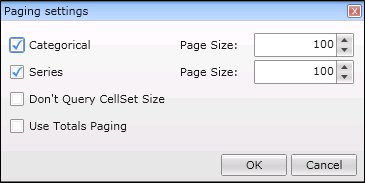
Click Paging on the toolbar to adjust the page size, and do one of the following.
- Select the Don't Query CellSet Size option to aid performance by eliminating a second query to get the page count for the pager. In this case, the pager will show Page 3, for example, instead of Page 3 of 5.
- Use Totals Paging option lets you count total and sub-total rows as part of the page size.
Page size is the maximum number of categorical rows and grouping/series columns that can be displayed in the OLAP grid). Paging controls appear in the Categorical and Grouping axes based on the page size and data.
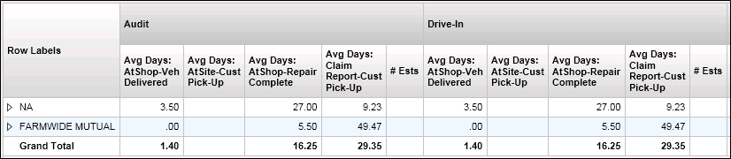
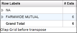
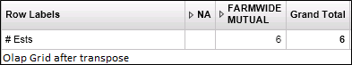
- Click Transpose on the toolbar to transpose the rows and columns of the OLAP grid.
![]()

- Click Freeze on the toolbar to freeze (or un-freeze) the cell set displayed in the OLAP chart/grid.
The chart/grid won't be updated until the cell set is unfrozen. A typical usage is to freeze the cell set first, then drag the measures and dimensions that you are interested in to the various axes. When you are ready to view the results, simply click the Freeze button once more to unfreeze the cell set and see your changes applied.

- Click Undo on the toolbar to undo a previous operation, such as expanding a row label.
- Click Redo on the toolbar to re-apply a previous operation which you chose to undo.
Data that is displayed in the OLAP grid can be copied to the Windows clipboard, for example, and then pasted into an external application such as Microsoft Excel or Notepad.
- Select the grid row containing the values you want to copy.
- Press CTRL-C to copy the values in the entire row to the clipboard.
- Go to your application (e.g. Excel, Notepad) and paste the (tab-delimited) values as desired.

A bookmark is similar in concept to “Save Reports” in earlier versions of the analysis tools.
A bookmark saves the ad-hoc report generated by user on dashboard as well as any formulas which have been applied. This lets the user return to the exact state the dashboard was in when the bookmark was created.
-
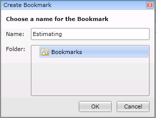
Click Bookmark on the toolbar. The Create Bookmark dialog is displayed.
-
Enter a name for the bookmark.
-
Choose the folder location for the new bookmark.
-
Click OK.
-
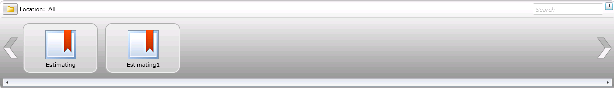
Click the expand button at the bottom right corner of the window to view the navigation bar.
-
The list of bookmarks is displayed in the navigation bar preview list.
-
Drag a bookmark from the preview list to the viewing area (or double-click on a bookmark) in order to view the corresponding dashboard.

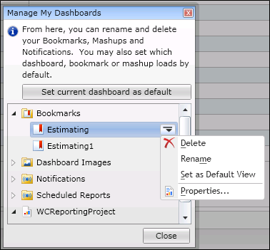
- Click Manage on the toolbar.
- Use the Manage My Dashboards dialog, expand the Bookmarks folder to delete or rename bookmark.

- In the toolbar click Export to export data from the current dashboard.
For more details and a walk through on exporting dashboards go to http://support.dundas.com/Dashboard5.Viewing_Exporting.ashx#__Exporting_to_Excel_or_CSV_1

A scheduled report is a task that enables the user to export data from one or more cubes on a one-time or recurring basis. You can create and manage scheduled reports while viewing dashboards. The exported data can be delivered to recipients as links or email attachments.
For more information on creating scheduled reports go to http://support.dundas.com/Dashboard5.ScheduledReports.ashx#__Creating_a_scheduled_report_10

- In the toolbar click Print to print the current dashboard.
Formulas can be added while viewing an analytical dashboard.
-
Right-click the chart or data grid and choose a formula from the Apply Formula menu.
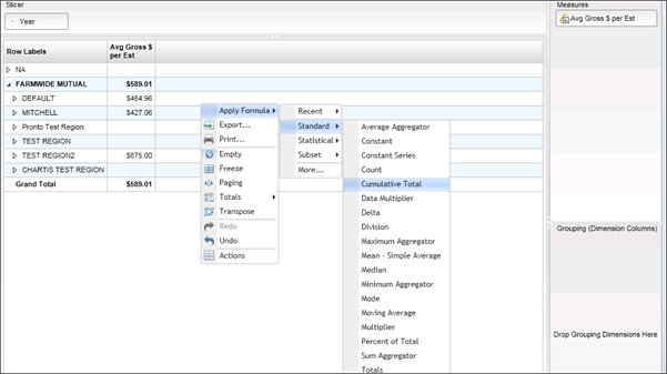
This menu is unavailable if you have added one or more dimensions to the Grouping pane/axis.
-
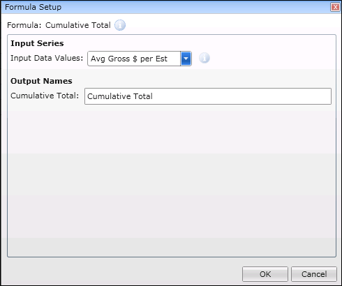
Use the Formula Setup dialog to configure the formula.
-
click OK to apply it to your OLAP data.
The formula result is added to the measures axis as a new measure.
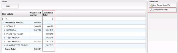
The formula is not applied to the totals row (i.e. corresponding cell is empty). Also, formula results are always limited to the page size in the report. (In other words, formulas do not support paging; formula results apply to the current page only and do not span across pages). For more details and a walkthrough on adding formulas go to http://support.dundas.com/Dashboard5.Viewing_Formulas.ashx
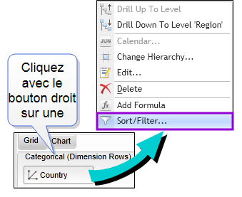
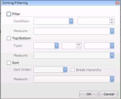
The menu for a categorical dimension or a grouping dimension allows you to filter or sort dimension members based on measure values.
-
Right click a Categorical (Dimension Rows) value to open the options menu.
-
Click Sort/Filter to choose your sort and filter options.
-
Do one of the following.
- Use the Filter option to filter the dimension based on measure value comparisons.
- Use the Top/Bottom option to display the top-most or bottom-most dimension members based on measure values.
- Use the Sort option to sort your dimension members based on measure values. If the Break Hierarchy option is also chosen, the dimension members will be sorted without maintaining the hierarchy between members.
-
Click OK to save your settings.
When using the Filter, Top/Bottom option, or Sort Order and Break Hierarchy options, the list buttons for moving up or drilling down into dimension members in the hierarchy are hidden from the Analytical chart and grid.
- Right-click the chart and choose Report Customization.
- Add a new visualization for each series that you want to customize, and select the measures that the series will display.
- To change the series appearance or to use a separate Y axis, click Edit to access these options.
- When finished, click OK.
Report customizations do not apply when the data is transposed.